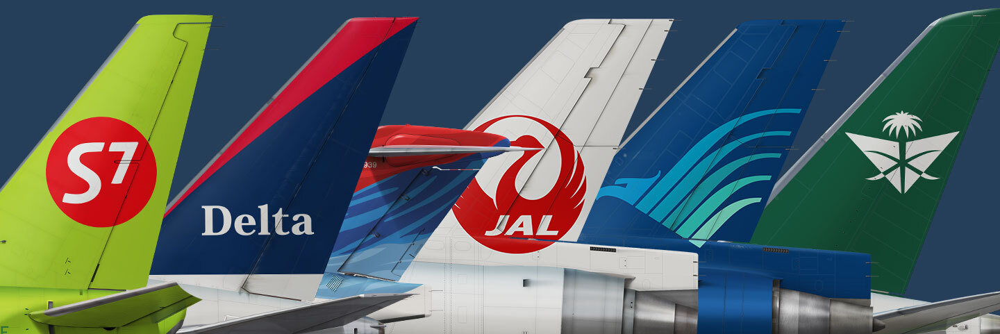
The first part told the story of how a small agency operating from a ferry in San Francisco Bay became the chief architect of the visual language of global aviation. British Airways, Singapore Airlines, FedEx, Cathay Pacific — each of those projects marked a turning point for an entire era. But the Landor Associates story does not end with the iconic work of the eighties and nineties. The agency kept working — and the further it went, the more interesting the commissions became: from a bold Novosibirsk startup breaking into the Russian market to the national carrier of Indonesia, from a legend of Japanese aviation to a complete reimagining of a Saudi airline's identity. So we carry on.
S7 Airlines: A Green Provocation from Siberia, 2005
In 2005, Landor received one of the most unconventional aviation briefs in its history. Novosibirsk-based Siberia Airlines — Russia's second-largest carrier, grown from a regional Soviet aviation unit — did not simply want a new livery. It wanted to become an entirely different airline.
According to Peter Knapp, Landor's Creative Director for Europe and the Middle East, the airline approached the agency's London office directly, having heard of its reputation in the industry. They needed someone who could understand the dynamics of the local commercial market while holding it within a global frame of reference. The agency pitched and was selected for its unconventional approach and depth of experience.
Landor Associates carried out a complete overhaul of the company's corporate identity: everything that had anchored the airline to the image of a regional carrier was stripped away. The Cyrillic word "Siberia" and the Siberian fir tree on the tail gave way to an entirely new identity. The objective was clear: to bring the airline in from the periphery and onto the international stage.
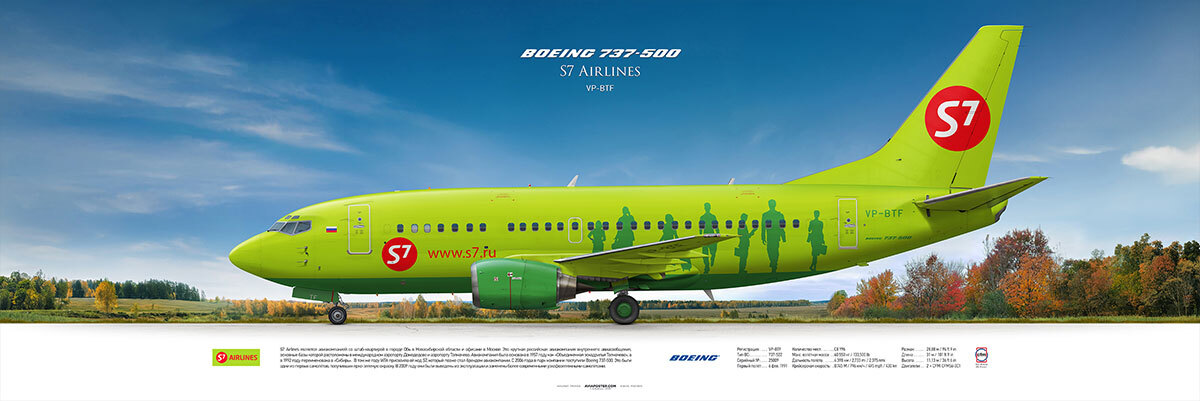
The rich apple-green fuselage was a genuine provocation. In a world where airlines habitually reached for blue, grey or white, a green aircraft bearing the spare logo "S7" read as a manifesto. The new livery quickly acquired a playful nickname among the public — the "little green men" — on account of the passenger silhouettes placed along the rear of the fuselage. As if the people walking up the airstairs were being imprinted onto the body of the aircraft itself.
Landor also designed new uniforms for the cabin crew. The S7 project stands as one of the most significant rebrands in post-Soviet aviation history: for the first time, a Russian private airline received an identity built to the standard of the best international work — not an adaptation of a Western template, but an independent, bold and genuinely memorable statement.
S7 Airlines: A Green Provocation from Siberia, 2005
In 2005, Landor received one of the most unconventional aviation briefs in its history. Novosibirsk-based Siberia Airlines — Russia's second-largest carrier, grown from a regional Soviet aviation unit — did not simply want a new livery. It wanted to become an entirely different airline.
According to Peter Knapp, Landor's Creative Director for Europe and the Middle East, the airline approached the agency's London office directly, having heard of its reputation in the industry. They needed someone who could understand the dynamics of the local commercial market while holding it within a global frame of reference. The agency pitched and was selected for its unconventional approach and depth of experience.
Landor Associates carried out a complete overhaul of the company's corporate identity: everything that had anchored the airline to the image of a regional carrier was stripped away. The Cyrillic word "Siberia" and the Siberian fir tree on the tail gave way to an entirely new identity. The objective was clear: to bring the airline in from the periphery and onto the international stage.
The rich apple-green fuselage was a genuine provocation. In a world where airlines habitually reached for blue, grey or white, a green aircraft bearing the spare logo "S7" read as a manifesto. The new livery quickly acquired a playful nickname among the public — the "little green men" — on account of the passenger silhouettes placed along the rear of the fuselage. As if the people walking up the airstairs were being imprinted onto the body of the aircraft itself.
Landor also designed new uniforms for the cabin crew. The S7 project stands as one of the most significant rebrands in post-Soviet aviation history: for the first time, a Russian private airline received an identity built to the standard of the best international work — not an adaptation of a Western template, but an independent, bold and genuinely memorable statement.
Delta Air Lines: Thirty Years Later, 1996–2000
For most passengers, Delta is simply a large American airline. For those who follow the history of aviation branding, however, Delta is one of its most instructive case studies — a story of how a celebrated livery can be undone by an ill-judged sequel.
When Landor Associates took on Delta in the mid-nineties, the challenge was a formidable one: this was the airline's first serious redesign in more than thirty years. The new visual identity was developed by the agency's London office. As Richard Ford, Landor's Executive Director for Europe, explained at the time, Delta did not need radical repositioning — its market standing was unassailable. What it needed was a "restrained and tactful modernisation" after more than three decades in the same livery.
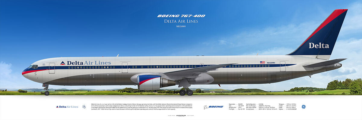
The 1997 livery preserved the spirit of its predecessor: the cheatline now curved elegantly over the nose cone with a red accent, the tail was painted entirely blue, and a curved red stripe ran along its leading edge. The design community received it warmly — elegant, professional, respectful of the brand's heritage, as though the famous "widget," Delta's trademark triangle, had finally grown up.
Yet by 2000, Delta had changed course again. This time, the line along the fuselage disappeared., while the tail carried a three-colour wave pattern in red, dark blue and sky blue — suggestive of billowing fabric. The livery was officially named "Colors in Motion," though the public wasted no time inventing rather more colourful names for it — "Deltaflot" and "the gravy wave" among the more popular. Landor also reworked the widget itself, softening its hard angles into flowing curves.
"Colors in Motion" did not last long. It was replaced in 2007, when Delta emerged from bankruptcy. It entered the record not as a masterpiece but as a lesson: even Landor produces work that gets ahead of its audience — or simply misreads it. Either way, two decades of collaboration with Delta — from 1996 through the early 2000s — illustrate just how demanding it is to refresh the identity of a mature brand carrying the weight of a long history.
For most passengers, Delta is simply a large American airline. For those who follow the history of aviation branding, however, Delta is one of its most instructive case studies — a story of how a celebrated livery can be undone by an ill-judged sequel.
When Landor Associates took on Delta in the mid-nineties, the challenge was a formidable one: this was the airline's first serious redesign in more than thirty years. The new visual identity was developed by the agency's London office. As Richard Ford, Landor's Executive Director for Europe, explained at the time, Delta did not need radical repositioning — its market standing was unassailable. What it needed was a "restrained and tactful modernisation" after more than three decades in the same livery.
The 1997 livery preserved the spirit of its predecessor: the cheatline now curved elegantly over the nose cone with a red accent, the tail was painted entirely blue, and a curved red stripe ran along its leading edge. The design community received it warmly — elegant, professional, respectful of the brand's heritage, as though the famous "widget," Delta's trademark triangle, had finally grown up.
Yet by 2000, Delta had changed course again. This time, the line along the fuselage disappeared., while the tail carried a three-colour wave pattern in red, dark blue and sky blue — suggestive of billowing fabric. The livery was officially named "Colors in Motion," though the public wasted no time inventing rather more colourful names for it — "Deltaflot" and "the gravy wave" among the more popular. Landor also reworked the widget itself, softening its hard angles into flowing curves.
"Colors in Motion" did not last long. It was replaced in 2007, when Delta emerged from bankruptcy. It entered the record not as a masterpiece but as a lesson: even Landor produces work that gets ahead of its audience — or simply misreads it. Either way, two decades of collaboration with Delta — from 1996 through the early 2000s — illustrate just how demanding it is to refresh the identity of a mature brand carrying the weight of a long history.
Japan Airlines: The Crane's Three Lives, 1989–2011
If there is a single symbol that outlived itself, was killed off by professional designers, and was then resurrected by the aviation public — it is the Japanese crane, the *tsuru*, on the tail of Japan Airlines. And in all three acts of that drama, Landor Associates played a part.
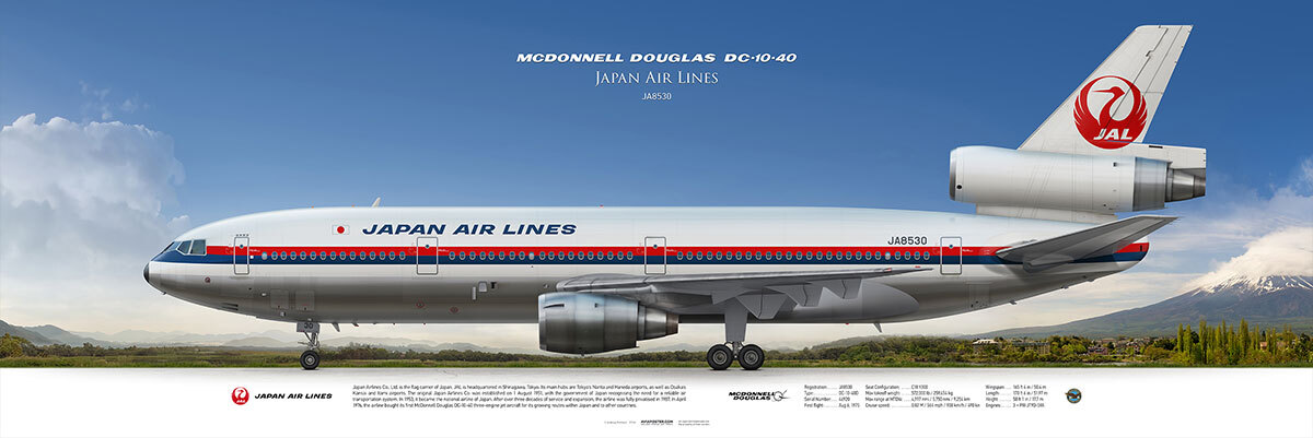
In 1989, the agency was commissioned to develop a new visual identity for JAL. The brief was delicate: the design needed to reflect the airline's strategic evolution while preserving the legendary crane that had graced its tails since 1958. Landor delivered — the 1989 livery was a significant step forward. The crane on the vertical stabiliser remained, but was made smaller and repositioned higher. The main innovation was a new JAL logotype — a red square paired with a grey rectangular stripe along the nose, with the words "Japan Airlines" in small black lettering. Within the abbreviation, a red bar cut diagonally through the letter "A" — something that many observers read as a nod to a samurai sword.
Landor returned to JAL a second time in 2002. Following the airline's merger with Japan Air System, the carrier was looking for a fundamentally new identity. The agency's London office, working together with its Tokyo studio, developed the "Arc of the Sun" livery. The redesign began in April 2002 and was completed in the spring of 2004. And then the unthinkable happened: the crane disappeared from the tails. For the first time in half a century. In its place came a dynamic red-and-silver design bearing the JAL letters — modern, corporate and stripped of warmth. Aviation enthusiasts around the world experienced it as a loss.
They were right. In 2010, JAL went bankrupt, underwent restructuring, and on 1 April 2011 announced the crane's return. Tellingly, the redesign of the *tsurumaru* for a new generation — simplified, with cleaner geometry — was also carried out by Landor Associates. The new version shed the ornamental detail of the original in favour of bolder, more economical lines, symbolising the airline's renewal without breaking the thread of fifty years of history. The crane came back — and this time it stayed. It is perhaps the most eloquent argument that a powerful symbol outlasts any design concept built around it.
If there is a single symbol that outlived itself, was killed off by professional designers, and was then resurrected by the aviation public — it is the Japanese crane, the *tsuru*, on the tail of Japan Airlines. And in all three acts of that drama, Landor Associates played a part.
In 1989, the agency was commissioned to develop a new visual identity for JAL. The brief was delicate: the design needed to reflect the airline's strategic evolution while preserving the legendary crane that had graced its tails since 1958. Landor delivered — the 1989 livery was a significant step forward. The crane on the vertical stabiliser remained, but was made smaller and repositioned higher. The main innovation was a new JAL logotype — a red square paired with a grey rectangular stripe along the nose, with the words "Japan Airlines" in small black lettering. Within the abbreviation, a red bar cut diagonally through the letter "A" — something that many observers read as a nod to a samurai sword.
Landor returned to JAL a second time in 2002. Following the airline's merger with Japan Air System, the carrier was looking for a fundamentally new identity. The agency's London office, working together with its Tokyo studio, developed the "Arc of the Sun" livery. The redesign began in April 2002 and was completed in the spring of 2004. And then the unthinkable happened: the crane disappeared from the tails. For the first time in half a century. In its place came a dynamic red-and-silver design bearing the JAL letters — modern, corporate and stripped of warmth. Aviation enthusiasts around the world experienced it as a loss.
They were right. In 2010, JAL went bankrupt, underwent restructuring, and on 1 April 2011 announced the crane's return. Tellingly, the redesign of the *tsurumaru* for a new generation — simplified, with cleaner geometry — was also carried out by Landor Associates. The new version shed the ornamental detail of the original in favour of bolder, more economical lines, symbolising the airline's renewal without breaking the thread of fifty years of history. The crane came back — and this time it stayed. It is perhaps the most eloquent argument that a powerful symbol outlasts any design concept built around it.
Garuda Indonesia: A Bird from the Heart of the Archipelago, 1985 and 2009
Garuda Indonesia is an airline whose very name sounds like mythology. Garuda is the sacred bird of Hindu tradition, the national symbol of Indonesia, emblazoned on the country's coat of arms. When the airline's leadership decided in 1985 to hire a foreign branding agency for a complete redesign, it caused a genuine scandal.
Many considered the decision to hand the rebrand to Landor Associates both wasteful and a form of national humiliation: why bring in Americans to explain to Indonesians what their national airline should look like? In time, however, the move came to be recognised as strategically sound — even necessary — for Garuda's standing as a national carrier.
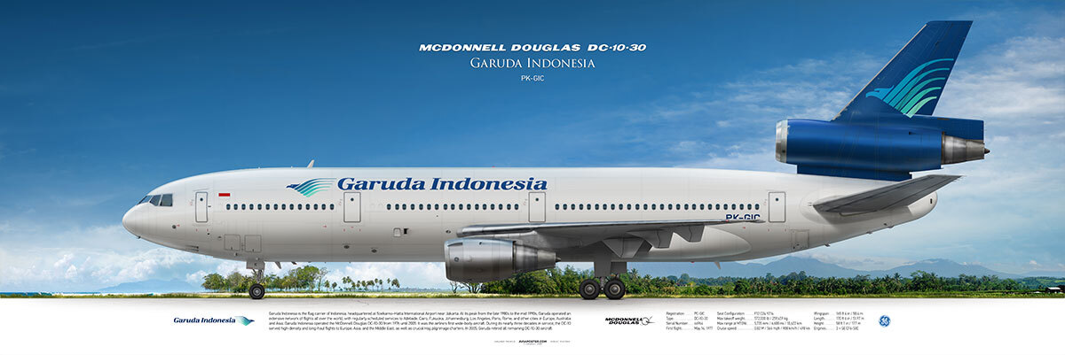
Landor created a new logo: a stylised silhouette of the Garuda bird, formed from five curving lines representing feathers. The colour scheme was completely replaced: in place of the traditional red and white came a deep royal blue and the colour of sea-water — aquamarine. In the designers' thinking, this combination captured the nature of Indonesia as seen from the air — an endless interplay of tropical green and warm ocean.
The logo proved so successful that it served the airline for twenty-four years. In 2009, Garuda returned to Landor for the next iteration of its visual identity. The new concept was named "Natural Wing," drawing its inspiration from the wings of tropical birds and the shifting surface of the sea. The bird developed by Landor in 1985 survived into the new logo with only minor changes — and continues to fly to this day.
The Garuda Indonesia story is a rare example of a symbol that does not age when it is made well: it simply refreshes itself while remaining recognisable. And of how professional trust, once earned, compounds into a decades-long partnership.
Garuda Indonesia is an airline whose very name sounds like mythology. Garuda is the sacred bird of Hindu tradition, the national symbol of Indonesia, emblazoned on the country's coat of arms. When the airline's leadership decided in 1985 to hire a foreign branding agency for a complete redesign, it caused a genuine scandal.
Many considered the decision to hand the rebrand to Landor Associates both wasteful and a form of national humiliation: why bring in Americans to explain to Indonesians what their national airline should look like? In time, however, the move came to be recognised as strategically sound — even necessary — for Garuda's standing as a national carrier.
Landor created a new logo: a stylised silhouette of the Garuda bird, formed from five curving lines representing feathers. The colour scheme was completely replaced: in place of the traditional red and white came a deep royal blue and the colour of sea-water — aquamarine. In the designers' thinking, this combination captured the nature of Indonesia as seen from the air — an endless interplay of tropical green and warm ocean.
The logo proved so successful that it served the airline for twenty-four years. In 2009, Garuda returned to Landor for the next iteration of its visual identity. The new concept was named "Natural Wing," drawing its inspiration from the wings of tropical birds and the shifting surface of the sea. The bird developed by Landor in 1985 survived into the new logo with only minor changes — and continues to fly to this day.
The Garuda Indonesia story is a rare example of a symbol that does not age when it is made well: it simply refreshes itself while remaining recognisable. And of how professional trust, once earned, compounds into a decades-long partnership.
Saudia: A Return to the Source, 2023
In 2023, Landor — now operating as Landor & Fitch — completed one of its most unusual aviation projects: the rebranding of Saudi Arabia's national carrier, Saudia. What made it unusual was not what was invented, but what was found. The agency's team, immersed in the airline's archives, concluded that the best possible move was to go back.
The foundation of the new visual identity was a principle the team called "best of the past": working closely with the Saudia team, the agency traced the entire history of the brand, and the 1972 livery — the one the airline had revisited for its 75th anniversary — emerged as the purest expression of the carrier's identity. It was this livery that was recognised as the high-water mark and given a new life in reinterpreted form.
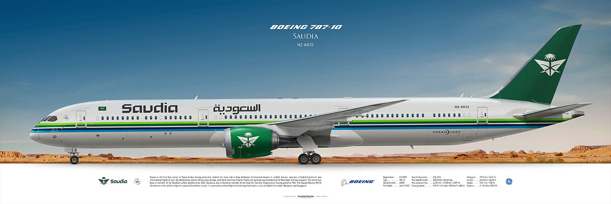
The three colours of the new identity — green, blue and sand — were chosen as a reflection of Saudi culture and its deepest values. The airline's emblem, featuring two crossed swords and a date palm, was refined: the lines were softened, the overall impression made more open and welcoming. In the words of Landor & Fitch's Executive Creative Director Ryan Frost, the aviation branding industry suffers from a widespread sameness — everyone plays it safe, and as a result, everything looks the same. For Saudia, the opposite path was proposed: not to mimic global norms, but to speak in the language of its own culture.
The rebrand extended across every passenger touchpoint: from livery and logo to cabin interiors, departure lounges, staff uniforms and even a bespoke fragrance. A unique sonic identity was created for the brand, weaving together traditional elements of Saudi music with contemporary motifs. In the two years following the rebrand, the value of the Saudia brand grew by 80%, while passenger numbers and revenues rose by more than 20%. It may be the most compelling argument yet that authenticity outperforms universality.
In 2023, Landor — now operating as Landor & Fitch — completed one of its most unusual aviation projects: the rebranding of Saudi Arabia's national carrier, Saudia. What made it unusual was not what was invented, but what was found. The agency's team, immersed in the airline's archives, concluded that the best possible move was to go back.
The foundation of the new visual identity was a principle the team called "best of the past": working closely with the Saudia team, the agency traced the entire history of the brand, and the 1972 livery — the one the airline had revisited for its 75th anniversary — emerged as the purest expression of the carrier's identity. It was this livery that was recognised as the high-water mark and given a new life in reinterpreted form.
The three colours of the new identity — green, blue and sand — were chosen as a reflection of Saudi culture and its deepest values. The airline's emblem, featuring two crossed swords and a date palm, was refined: the lines were softened, the overall impression made more open and welcoming. In the words of Landor & Fitch's Executive Creative Director Ryan Frost, the aviation branding industry suffers from a widespread sameness — everyone plays it safe, and as a result, everything looks the same. For Saudia, the opposite path was proposed: not to mimic global norms, but to speak in the language of its own culture.
The rebrand extended across every passenger touchpoint: from livery and logo to cabin interiors, departure lounges, staff uniforms and even a bespoke fragrance. A unique sonic identity was created for the brand, weaving together traditional elements of Saudi music with contemporary motifs. In the two years following the rebrand, the value of the Saudia brand grew by 80%, while passenger numbers and revenues rose by more than 20%. It may be the most compelling argument yet that authenticity outperforms universality.
---
In Place of a Conclusion: The Agency That Does Not Stop
Delta, JAL, Garuda, Saudia, S7 — five stories, five continents, five decades. Looked at together, something important comes into focus: Landor Associates never did the same thing twice. The green aircraft from Siberia and the retro revival of a Saudi airline are the work of the same agency — yet they could not be more different. JAL, which survived bankruptcy and brought its crane home, and Garuda, which for the first time in its history traded the colours of its national flag for the blue of the ocean — these are unlike solutions, born from unlike understandings of what it means to be a national carrier.
That is the central lesson of Landor Associates: there is no universal formula. There is only the ability to listen, to immerse yourself in context — and to find the solution that feels like the only possible one, even though no one had seen it before you. That is branding at its finest. Not decoration, but a precise statement. Not fashion, but character. And it is a character that endures — on the tails of aircraft, in the memory of passengers, in the history of design.